Air Pollution in Haifa
Exploratory data analysis
As part of a project evaluating the effect of Haifa’s low emission zone (LEZ) using the synthetic control method (coming soon!), I ran a short exploration of the data. It’s always beneficial to have a thorough look at the data before starting to model it. I think it’s safe to say that any investment of time in exploratory data analysis will be returned at a later stage in terms of better modelling insights, less bugs and valid conclusions.
Disclaimer: I have no expertise in air quality analysis, in fact this is the first time I look at data collected from an air pollution monitoring system.
This post was generated from a Jupyter notebook, which can be downloaded from here.
The notebook goes through the following steps:
- Dataset cleaning and tidying
- Handling of missing values
- Analyzing trends of time series (daily, weekly, annual etc)
- Finding correlations between pairs of variables
- Data fusion with meteorological dataset
At a later stage, these sections will be added:
- Simple air pollution modelling
- Validation of the inference conducted for the ministry regarding the effect of Haifa’s LEZ.
Dataset sources
- Air quality monitoring data was downloaded from the website of Israel’s Ministry of Environmental Protection. The interface can be found here.
- Temperature data was downloaded from Israel Meteorological Service’s website. The interface can be found here.
The raw data looks like this:
df_aqm = pd.read_csv('Data/Haifa-Atzmaut.csv')
df_aqm
| תחנה:עצמאות חיפה - | SO2 | Benzene | PM2.5 | PM10 | CO | NO2 | NOX | NO | תאריך \ שעה | |
|---|---|---|---|---|---|---|---|---|---|---|
| 0 | ppb | ppb | µg/m³ | µg/m³ | ppm | ppb | ppb | ppb | ||
| 1 | 29.7 | 44.4 | 0.6 | 41.2 | 114.8 | 73.8 | 31/12/2011 24:00 | |||
| 2 | 30.6 | 45.5 | 0.6 | 35.6 | 81.1 | 45.6 | 01/01/2012 00:05 | |||
| 3 | 30.6 | 45.5 | 0.5 | 40.7 | 107.9 | 67.0 | 01/01/2012 00:10 | |||
| 4 | 30.2 | 45.1 | 0.5 | 41.7 | 127.9 | 86.2 | 01/01/2012 00:15 | |||
| ... | ... | ... | ... | ... | ... | ... | ... | ... | ... | ... |
| 883289 | 23/04/2020 02:15 | 31/03/2014 22:00 | 02/03/2014 17:00 | 07/02/2012 14:30 | 06/01/2020 13:40 | 18/01/2017 13:05 | 22/01/2015 07:30 | 22/01/2015 07:30 | תאריך מקסימלי | |
| 883290 | 1.7 | 0.24 | 19.8 | 49.7 | 0.4 | 20.8 | 42.6 | 21.8 | Avg | |
| 883291 | 237295 | 602180 | 800202 | 97432 | 844796 | 827176 | 826981 | 826945 | כמות ערכים | |
| 883292 | 27 | 68 | 91 | 11 | 96 | 94 | 94 | 94 | נתון[%] | |
| 883293 | 2.8 | 0.3 | 17.8 | 50.0 | 0.2 | 16.3 | 58.6 | 46.0 | סטיית תקן |
883294 rows × 10 columns
Dataset Cleaning
The following steps are needed to clean the dataset:
- Delete the first column, which contains only the station’s name
- Strip the column names of leading and trailing whitespaces
- Translate the Hebrew date/time column
- Replace the representation of midnight from 24:00 to 00:00 to comply with Python’s DateTime
- Drop the first row, which contains the units of measurements for the variables
- Drop the last 8 rows, which contain summary statistics
- Numerify the measurements, setting missing values to NaN
- Set the datetime variable as index
station_name = df_aqm.columns[0]
df_aqm.drop(columns=[station_name], inplace=True)
df_aqm.rename(columns={colname: colname.strip() for colname in df_aqm.columns}, inplace=True)
df_aqm.rename(columns={df_aqm.columns[-1]: 'DateTime'}, inplace=True)
df_aqm['DateTime'] = df_aqm['DateTime'].apply(lambda x: x.strip().replace('24:00', '00:00'))
pollutants = list(df_aqm)
pollutants.remove('DateTime')
units = {colname: df_aqm.loc[0, colname].strip() for colname in pollutants}
df_aqm = df_aqm.iloc[1:-8]
df_aqm[pollutants] = df_aqm[pollutants].apply(pd.to_numeric, errors='coerce')
df_aqm['DateTime'] = pd.to_datetime(df_aqm['DateTime'],infer_datetime_format=True)
df_aqm = df_aqm.set_index('DateTime')

print(f'The dataset spans {len(np.unique(df_aqm.index.date))} days,'
      f'from {df_aqm.index[0].date()} to {df_aqm.index[-1].date()}')
The dataset spans 3068 days,from 2011-12-31 to 2020-05-24
Let’s have a look at a 2-month slice of the cleaned dataset:
df_aqm.loc["2018-04":"2018-05"]
| SO2 | Benzene | PM2.5 | PM10 | CO | NO2 | NOX | NO | |
|---|---|---|---|---|---|---|---|---|
| DateTime | ||||||||
| 2018-04-01 00:05:00 | 1.8 | 0.18 | 7.4 | NaN | 0.3 | 22.2 | 23.6 | 1.4 |
| 2018-04-01 00:10:00 | 2.0 | 0.18 | 9.5 | NaN | 0.3 | 26.3 | 27.9 | 1.5 |
| 2018-04-01 00:15:00 | NaN | 0.18 | 13.7 | NaN | 0.3 | 24.6 | 25.2 | 0.5 |
| 2018-04-01 00:20:00 | NaN | 0.18 | 16.8 | NaN | 0.3 | 25.0 | 25.9 | 0.9 |
| 2018-04-01 00:25:00 | NaN | 0.18 | 17.4 | NaN | 0.4 | 24.2 | 24.7 | 0.6 |
| ... | ... | ... | ... | ... | ... | ... | ... | ... |
| 2018-05-31 23:40:00 | 0.0 | 0.08 | 8.0 | NaN | 0.3 | 7.2 | 7.5 | 0.5 |
| 2018-05-31 23:45:00 | 0.0 | 0.08 | 7.5 | NaN | 0.3 | 6.7 | 7.1 | 0.2 |
| 2018-05-31 23:50:00 | 0.0 | 0.08 | 6.4 | NaN | 0.3 | 10.2 | 11.2 | 1.2 |
| 2018-05-31 23:55:00 | 0.0 | 0.08 | 6.6 | NaN | 0.3 | 9.1 | 10.1 | 1.0 |
| 2018-05-31 00:00:00 | 0.0 | 0.08 | 9.8 | NaN | 0.3 | 7.7 | 7.4 | 0.0 |
17568 rows × 8 columns
Not bad! Nice and tidy.
Some notes about the data
- Measurements are recorded at 5-minute intervals. That’s a very high resolution, much more than needed to answer the research question. But it’ll be very helpful - it will allow for aggressive smoothing of the noisy measurements. In total, we have almost 1 million measurements of each pollutant.
- From the slice above we can suspect that the measurement resolution for CO (Carbon Monoxide) might be small compared to its distribution. It’s easy to check:
df_aqm['CO'].value_counts(normalize=True).head(7)
0.3    0.338305
0.2    0.186482
0.4    0.182812
0.5    0.073091
0.1    0.051982
0.6    0.039140
0.0    0.035468
Name: CO, dtype: float64
And indeed more than 70% of the CO measurements fall in one of 3 distinct values. This implies that the CO measurement is not accurate enough in capturing this pollutant’s distribution. We should keep that in mind when drawing inferences based on CO.
Moving on to a general overview of the data, let’s use the convenient ‘describe’ method:
df_aqm.describe()
| SO2 | Benzene | PM2.5 | PM10 | CO | NO2 | NOX | NO | |
|---|---|---|---|---|---|---|---|---|
| count | 237295.000000 | 602180.000000 | 800202.000000 | 97432.000000 | 844796.000000 | 827176.000000 | 826981.000000 | 826945.000000 |
| mean | 1.718825 | 0.242009 | 19.774215 | 49.704957 | 0.366657 | 20.821325 | 42.579953 | 21.816400 |
| std | 2.763984 | 0.300786 | 17.774355 | 49.961126 | 0.249257 | 16.310098 | 58.644492 | 46.070798 |
| min | -0.800000 | -0.010000 | -29.500000 | -10.100000 | -0.400000 | -4.800000 | -4.600000 | -5.000000 |
| 25% | 0.100000 | 0.060000 | 10.800000 | 24.000000 | 0.200000 | 7.700000 | 8.500000 | 0.300000 |
| 50% | 0.800000 | 0.150000 | 17.200000 | 37.500000 | 0.300000 | 15.400000 | 19.300000 | 3.300000 |
| 75% | 2.400000 | 0.320000 | 25.400000 | 59.400000 | 0.400000 | 31.900000 | 51.300000 | 18.400000 |
| max | 136.200000 | 12.700000 | 562.000000 | 810.900000 | 23.400000 | 262.400000 | 865.500000 | 763.800000 |
We can immediately notice negative measurements for all pollutants. This is not a good sign, because while this can be easily addressed and fixed, it increases our suspicion of more serious problems in the dataset that would be difficult to identify.
But that will be addressed later. Now we have to solve the issue of negative measurements. Let’s first understand the extent of the problem:
percent_negative = 100*(df_aqm[pollutants] < 0).mean(axis=0).values
print(f'{pollutants[percent_negative.argmax()]} has {percent_negative.max():.1f}% negative values')
NO has 8.8% negative values
That’s quite bad. Two of the simplest ways to fix this issue are:
- Clip the negative values to 0
- Replace them with NaNs
However, these two approaches may or may not be the best thing to do, depending on:
- The mechanism that has caused this issue
- The quality of data required to answer the research question
Since I don’t have a substantiated answer to any of these questions, I tried to find out what domain practitioners recommend on doing. Here is a thread with some opinions and insights on the matter. The authors propose to differentiate between two situations, and act accordingly:
- If the datapoints exhibit sudden short drops below 0, this probably indicates an instrument malfunction. In this case, it is advised to replace the invalid value with an average of some neighborhood.
- If consecutive values below 0 are recorded for long times compared to the instrument’s integration time, this is probably rooted in the true air conditions. In this case, negative values imply that the real value was below the instrument’s detection limit. The suggested approach would be to replace the negative values with the known detection limit, or 0 if it isn’t known (like in our case). More justifications for this approach can be found in Polissar et al, 1998
If we want to follow these guidelines, we need to decide for each negative measurement if it the former case or the latter. This will be coded at a later stage.
Checking for systematic data collection flaws
It is important to make sure that our dataset does not have any systematic flaws in the data collection process. For example, later we would like to demonstrate the fluctuations of pollutants as function of the weekday. In this case, if some days are recorded significantly less often than other days, any conclusion we would like to state as for the weekday trend might be invalidated.
An easy way to check this is to print the value counts of the weekdays:
df_aqm['Weekday Name'] = df_aqm.index.day_name()
df_aqm['Weekday Name'].value_counts()
Sunday       126420
Saturday     126145
Friday       126144
Monday       126144
Wednesday    126144
Thursday     126144
Tuesday      126144
Name: Weekday Name, dtype: int64
We see that the dataset is pretty much balanced in terms of weekday logging, and that is reassuring. However, it could also be that the logging system simply adds an entry for every 5-minute interval, while the measurement instruments malfunction with some systematic (i.e not at random) pattern. A complete examination would be:
df_aqm[pollutants].isna().groupby(df_aqm['Weekday Name']).mean()
| SO2 | Benzene | PM2.5 | PM10 | CO | NO2 | NOX | NO | |
|---|---|---|---|---|---|---|---|---|
| Weekday Name | ||||||||
| Friday | 0.731030 | 0.271008 | 0.100235 | 0.892718 | 0.040160 | 0.061295 | 0.061430 | 0.061430 |
| Monday | 0.731204 | 0.394097 | 0.094646 | 0.887097 | 0.046114 | 0.067835 | 0.068121 | 0.068398 |
| Saturday | 0.730992 | 0.344128 | 0.100820 | 0.894621 | 0.043846 | 0.064632 | 0.064767 | 0.064767 |
| Sunday | 0.734813 | 0.313724 | 0.100791 | 0.884710 | 0.046757 | 0.060141 | 0.060354 | 0.060354 |
| Thursday | 0.728350 | 0.297026 | 0.093805 | 0.892662 | 0.043442 | 0.062254 | 0.062571 | 0.062579 |
| Tuesday | 0.733376 | 0.305429 | 0.084047 | 0.886312 | 0.043363 | 0.069159 | 0.069413 | 0.069413 |
| Wednesday | 0.729674 | 0.302345 | 0.084071 | 0.889745 | 0.041334 | 0.059353 | 0.059559 | 0.059559 |
We see that the fraction of missing data changes significantly from one pollutant to another. In addition, for each pollutant, the fraction of missing values changes per weekday, but for now it’s hard to say if these differences are consequential. Meanwhile, it’s good to keep this table in mind, and we might return to it depending on the analysis and inference that we would like to conduct.
So we can conclude this step with the reassurance that the data does not exhibit major systematic data collection flaws, and we can move on in to the analysis. Let’s plot the data in its most raw form - just a scatterplot of every datapoint:
axes=df_aqm[pollutants].plot(marker='.', alpha=0.5, linestyle='None', figsize=(11, 11), subplots=True, colormap='Dark2');
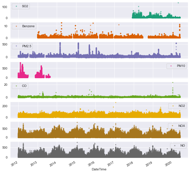
We can notice a few things from this plot:
- PM10 and SO2 are not continuously monitored along the 8 year period. Plots and analyses in the following will not ignore them, as we can still draw some conclusions using these limited measurements
- We can see the first hint of a seasonal trend: it seems like NOx and NO follow an annual trend. Because of the scatterplot’s density it could also be that only a few outliers paint a picture that looks like an annual trend, while in reality they do not contribute a significant amount to the total trend. Therefore a more detailed analysis is required to validate this claim
- It seems like NO2 and NOx are identical (or almost identical measurements). Reading about NOx it seems rather amusing, as NOx is defined as the sum the nitrogen oxides NO and NO2. But it is the visualization that is misleading, and a closer look reveals that NOx is always higher than NO2.
Let’s see if on average there is a real annual trend for some substances:
log_interval = 5  # minutes
samples_per_week = int(60 / log_interval * 24 * 7)
window = samples_per_week*4
overlap = int(2*samples_per_week)
df_aqm.rolling(
    window=window, center=False, min_periods=samples_per_week).mean()[samples_per_week*2::overlap].plot(
    marker='.', alpha=0.5, linestyle='None', figsize=(11, 11), subplots=True, colormap='Dark2');
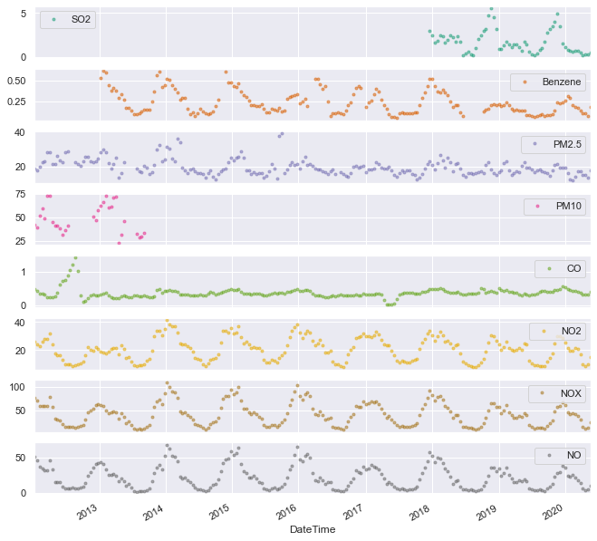
This plot shows rolling averages of the measurements, with windows of 4 weeks and an overlap of 2 weeks. A similar result could be obtained using a simple groupby with a monthly frequency:
df_aqm.groupby(pd.Grouper(freq='M')).mean()
But the overlapping windows add a degree of smoothing which is (arguably) preferable in this case.
If you are disappointed too with pandas' lack of an overlap parameter in the rolling function, you can contribute to the discussion here.
Anyway, enough with the ranting. The above plot shows that all nitrogen oxide measurements (and also benzene to a lesser extent) follow a clear annual trend peaking at winter. It is still not clear what’s the cause of this modulation, and we will revisit it later in the analysis.
The same trends could be demonstrated using a different visualization, plotting the 8 year daily averages of every pollutants.
df_aqm.groupby(df_aqm.index.dayofyear).mean().plot(marker='.', alpha=0.5, linestyle='None', figsize=(11, 11), subplots=True, colormap='Dark2');
plt.xlabel('Day of the Year');
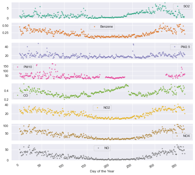
The annual trend of NO, NO2, NOx and benzene is validated through this plot. In addition, we can notice a peculiar drop in CO values around day 240. A closer look reveals that this drop is at day 243. This day is August 31st, the last day of summer vacation for 1.5 million kids. Coincidence? I don’t know. What do you think?
Let’s move now to a weekly analysis:
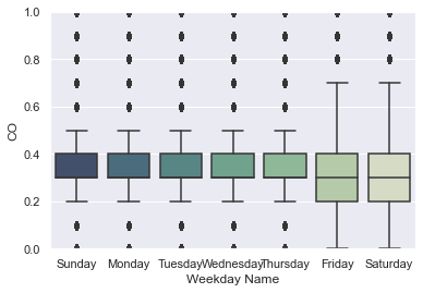
ax = sns.boxplot(data=df_aqm, x='Weekday Name', y='NOX',
                 order=['Sunday', 'Monday', 'Tuesday', 'Wednesday', 'Thursday', 'Friday', 'Saturday'],
                 palette=sns.cubehelix_palette(7, start=.5, rot=-.75, dark=0.3, reverse=True)).set_ylim([0,70]);
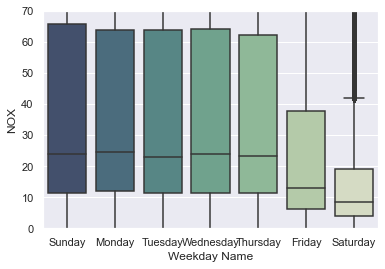
For NOx, there is a clear weekly trend in the amount of air pollution measured. Note that the outliers have been cropped out of the plot. For other pollutants, the trend is not as impressive:
ax = sns.boxplot(data=df_aqm, x='Weekday Name', y='CO',
                 order=['Sunday', 'Monday', 'Tuesday', 'Wednesday', 'Thursday', 'Friday', 'Saturday'],
                 palette=sns.cubehelix_palette(7, start=.5, rot=-.75, dark=0.3, reverse=True)).set_ylim([0,1]);
And we also see the discrete nature of the CO measurements, as noted earlier. Another way to look at the weekly flactations would be to plot the raw measurements for a specific period of time:
df_sub = df_aqm.loc['2019-07':'2019-09']
fig, ax = plt.subplots(figsize=(20,5))
ax.plot(df_sub.groupby(df_sub.index.date).median()['NOX'], marker='o', linestyle='-')
ax.set_ylabel('NOx [ppb]')
ax.set_title('')
ax.xaxis.set_major_locator(mdates.WeekdayLocator(byweekday=mdates.SATURDAY))
ax.xaxis.set_major_formatter(mdates.DateFormatter('%b %d'));
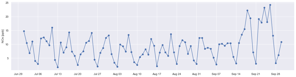
For this 3-month period, the lowest measured values were always on Saturdays, agreeing with the boxplot above.
The third and last seasonal trend to be analyzed is the dependence on the hour of the day.
df_aqm.groupby(df_aqm.index.time).mean().plot(marker='.', alpha=0.5, linestyle='None', figsize=(11, 11), subplots=True, colormap='Dark2');
plt.xticks(["08:00","12:00", "16:00", "20:00", "00:00", "04:00"]);
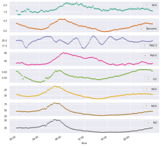
Some notes about this plot:
- Most pollutants peak in the morning. Some right at the rush hour (NO, NO2, NOX, Benzene) and some a bit later (SO2, PM10)
- It doesn’t seem like PM2.5 adheres to any logical pattern.
- CO peaks around midnight. It seems as it has a slow buildup process, followed by a slow decreasing phase.
- If nitrogen oxides are caused mainly by transportation, then the rush hour attribution above could make sense. In this case, we could also attribute the slow increase and plateau in the afternoon/evening to the fact (or assumption?) that commute back home is spread on longer hours, compared to the narrow rush hour.
- I’m no expert on the sources of each pollutant, be it transportation, industry, the port or natural factors. So I don’t know if any of these hypotheses make any sort of sense.
Air pollution and temperatures
The above trends show a clear correlation between the season/month and the average measured pollutants (at least for nitrogen oxides and benzene). But what is the cause of this modulation - is it the time itself? Or maybe it is the temperature? There could be many potential causes, and estimating each of these effects is a difficult problem, according to the identification strategies of causal inference. Instead, we can choose to stay in the realm of mere correlations, and while they do not imply causation, we could speculate what is a reasonable claim and what is not.
A simple examination would be to evaluate how much of this modulation is governed by the change in temperature (disregarding the day of the year). To this end, I downloaded a second dataset, this time from Israeli Meteorological Service. It includes daily measurements (low and high temperatures) from the meteorological station closest to the air quality monitoring station, situated at BAZAN Group’s plant in Haifa.
A straightforward cleaning yields a dataset that looks like this:
df_temp = pd.read_csv('Data/ims_data.csv', sep=",", encoding="ISO-8859-8")
# translate df from Hebrew
df_temp = df_temp.rename(columns={'משתנה': 'variable', 'תאריך': 'DateTime', 'חיפה בתי זיקוק                                    (600)': 'value'})
df_temp.loc[df_temp['variable'] == 'טמפרטורת מינימום(C°)', 'variable'] = 'min temp'
df_temp.loc[df_temp['variable'] == 'טמפרטורת מקסימום(C°)', 'variable'] = 'max temp'
df_temp.loc[df_temp['variable'] == 'טמפרטורת מינימום ליד הקרקע(C°)', 'variable'] = 'ground temp'

# Delete the record 'ground temp' (first make sure it's empty)
assert(df_temp.loc[df_temp['variable'] == 'ground temp','value'].values == '-').all()
df_temp = df_temp.drop(df_temp[df_temp['variable'] == 'ground temp'].index)

# Convert to datetime
df_temp['DateTime'] = pd.to_datetime(df_temp['DateTime'],infer_datetime_format=True)

df_temp['value'] = df_temp['value'].apply(pd.to_numeric, errors='coerce')

df_temp.tail()
| variable | DateTime | value | |
|---|---|---|---|
| 8638 | min temp | 2020-04-27 | 11.6 |
| 8640 | max temp | 2020-04-28 | 23.2 |
| 8641 | min temp | 2020-04-28 | 11.0 |
| 8643 | max temp | 2020-04-29 | 22.9 |
| 8644 | min temp | 2020-04-29 | 17.1 |
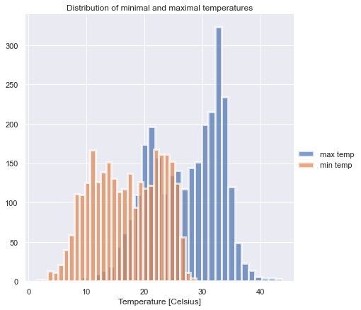
Let’s plot a histogram of the daily lows and highs, just to see that the dataset makes sense (it does):
g = sns.FacetGrid(df_temp, hue='variable', height=6)
g.map(sns.distplot, 'value', bins=30, hist=True, kde=False, hist_kws={"linewidth": 3, "alpha": 0.7})
g.add_legend(title=' ')
g.axes[0,0].set_title("Distribution of minimal and maximal temperatures")
g.axes[0,0].set_xlabel('Temperature [Celsius]');
To merge (fuse?) the datasets, we need to calculate an aggregate value for the pollutants for each day (because temperatures are measured only once a day). Averaging the measurements of each day is the simplest thing to do.
df_pol_day = df_aqm.groupby(df_aqm.index.date).mean()
df_pol_day.index = pd.to_datetime(df_pol_day.index)

df_max = df_temp.loc[df_temp['variable'] == 'max temp', ['DateTime', 'value']]
df_max.rename(columns={'value': 'max temp'}, inplace=True)
df_max.set_index('DateTime', inplace=True, drop=True)

df_min = df_temp.loc[df_temp['variable'] == 'min temp', ['DateTime', 'value']]
df_min.rename(columns={'value': 'min temp'}, inplace=True)
df_min.set_index('DateTime', inplace=True, drop=True)

df_pol_temp = df_pol_day.merge(right=df_max, how='inner', left_index=True, right_index=True)
df_pol_temp = df_pol_temp.merge(right=df_min, how='inner', left_index=True, right_index=True)
df_pol_temp.tail()
| SO2 | Benzene | PM2.5 | PM10 | CO | NO2 | NOX | NO | max temp | min temp | |
|---|---|---|---|---|---|---|---|---|---|---|
| 2020-04-25 | 0.031802 | 0.049213 | 10.824653 | NaN | 0.279152 | 1.761702 | 1.509220 | 0.010284 | 22.3 | 17.1 |
| 2020-04-26 | 0.089753 | 0.036250 | 9.450694 | NaN | 0.295406 | 6.074823 | 7.617376 | 1.686170 | 23.0 | 16.1 |
| 2020-04-27 | 0.217314 | 0.079306 | 12.359028 | NaN | 0.310247 | 18.504255 | 28.706383 | 10.386525 | 23.0 | 11.6 |
| 2020-04-28 | 0.595760 | 0.091632 | 13.841319 | NaN | 0.332155 | 17.207801 | 26.422340 | 9.412057 | 23.2 | 11.0 |
| 2020-04-29 | 0.102827 | 0.020035 | 10.708333 | NaN | 0.260777 | 1.787943 | 1.271986 | 0.000000 | 22.9 | 17.1 |
sns.jointplot(x='min temp', y='NOX', data=df_pol_temp, kind="reg", stat_func=corr_coef);
warnings.filterwarnings(action='default')
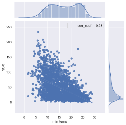
With a significant correlation of -0.58, the measured NOx values can be explained to some degree by the temperatures. It would be interesting to see if other meteorological factors, like humidity and wind, can explain even more of the NOx fluctuations.
Closing remarks
This notebook described a preliminary exploration of the air quality monitoring data in Haifa. It is by no means an exhaustive analysis, it is just a set of steps used to increase the understanding of the dataset. If you have any comment - an analysis that you think should be done, a peculiar result that should be examined or anything else - I would love to know!
This is not a conclusion, as it is only the start of the analysis. In the next chapter, I will evaluate the causal effect of Haifa’s new low emission zone using the synthetic control method. Stay tuned!